
Farmhouse Plate Rails for Art (Without Deep Shelves)

I love anything that lets you decorate upward instead of outward. In my tiniest studio apartment, I learned the hard way that “just add a shelf” can quietly eat the room. A shelf that sticks out 10 inches does not sound like much until you start turning sideways to pass the sofa.
Farmhouse plate rails are my favorite workaround. They give you that cozy, collected look, but they stay shallow, sit high on the wall, and keep your footprint clear. If you want to display rustic plates, thrifted frames, and little art prints without committing to deep floating shelves, this is the sweet spot.
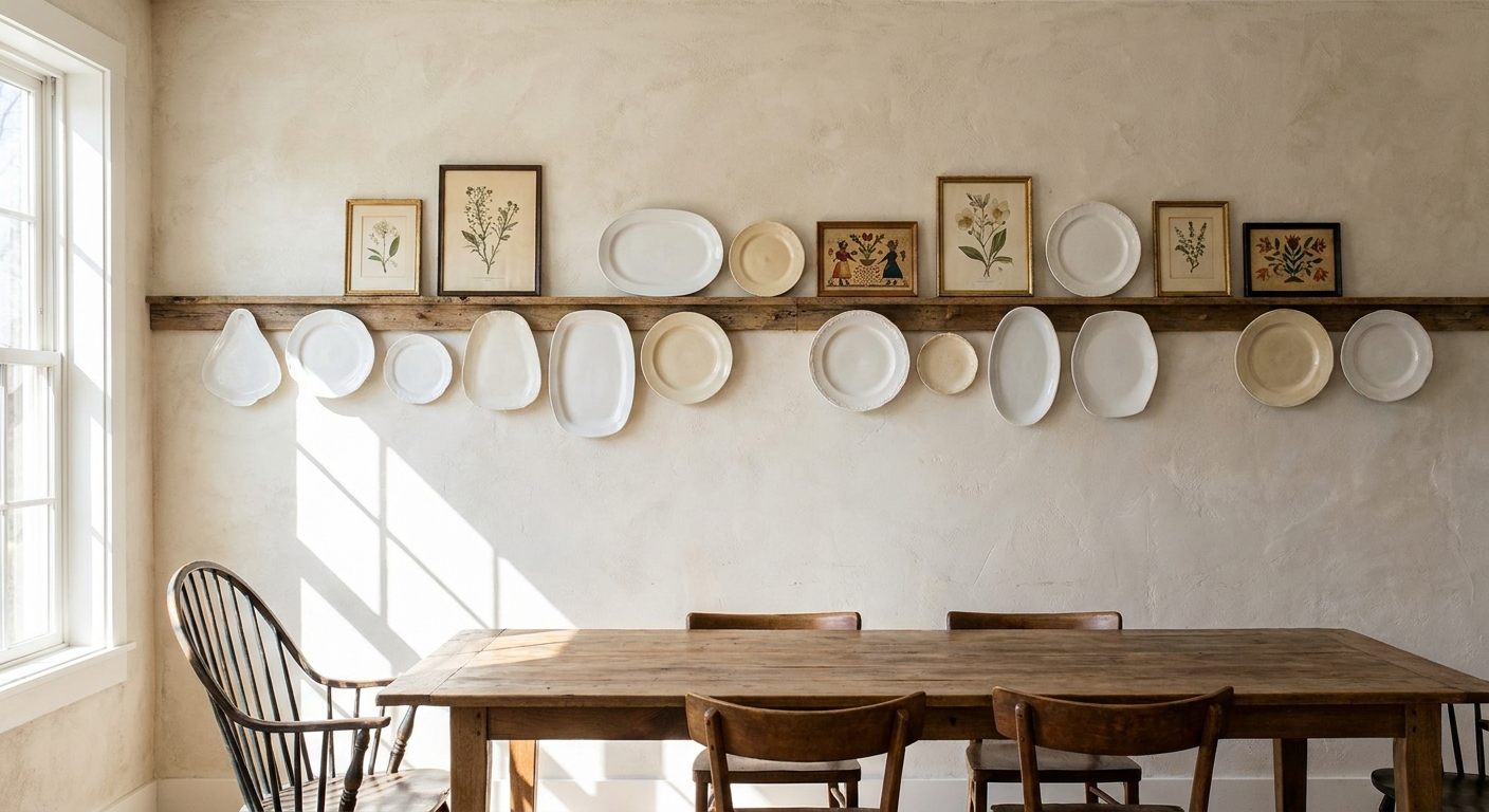
What a plate rail is
A plate rail is a narrow ledge designed to hold plates upright. Most versions include a small lip or groove at the front. Some styles also add pegs underneath, especially when the rail is part of a bigger wall system.
For small homes, the real win is depth. A plate rail can be shallow enough to avoid that “shelf sticking into the room” feeling, but still deep enough to support frames. When you mount it high on the wall, it becomes display space that does not compete with everyday living space.
- Less visual bulk: slim profile reads lighter than chunky shelves.
- Flexible styling: swap items seasonally without new holes in the wall.
- Farmhouse texture: stained wood, painted rails, and simple brackets all add character.
If you like the farmhouse vibe but want it to feel intentional, the bigger guide on the look is worth a skim: Farmhouse style guide.
Best rail sizes for art
If your goal is art (with a few plates mixed in), size the rail for frames first. Plates are forgiving. Frames with glass are the ones that slide if the ledge is too shallow or the lip is too low.
One quick clarity note: when I say ledge depth, I mean how far the little shelf projects from the wall, not the overall height of the rail.
My go-to measurements
- Ledge depth: 3 to 4 inches works for most small frames (think 5 x 7 up to many 8 x 10s) plus small plates. If your frames are very thick or you want to lean larger pieces, bump up cautiously and test with painter’s tape first.
- Front lip height: about 3/4 inch to 1 1/4 inches helps keep frames from creeping forward. A steeper wall angle or slick frame backs may need the higher end.
- Rail face height: 2 1/2 to 4 inches tall (the vertical face) looks balanced and sturdy.
- Clear space above the rail: leave about 8 to 12 inches so the display does not feel jammed into the ceiling line or crown molding.
In my own house, anything deeper than 4 inches starts to look like a real shelf, which is exactly what we are trying to avoid. If you want to hold larger frames, use two rails: one for the bigger pieces lower, one for the smaller pieces higher.
Where to place rails
Plate rails can look chaotic if they land at random heights or cut across other strong lines in the room. When I am deciding placement, I pick one anchor line to follow and stick with it.
Placement rules that rarely fail
- Follow the top of something: the top of a doorway, the top of a window casing, or the top of a tall cabinet. Aligning heights makes it look built-in.
- Stay out of head-bump territory: in narrow hallways or above seating, keep rails high enough that nobody’s head or shoulder brushes frames when standing up.
- Use the long wall trick: a long, high rail visually stretches a room. It is the same reason I like a simple gallery wall in tight spaces.
If your space is narrow and you want display without the squeeze, you might also like a minimalist gallery wall for a narrow hallway. A plate rail can do a similar job with fewer nail holes.
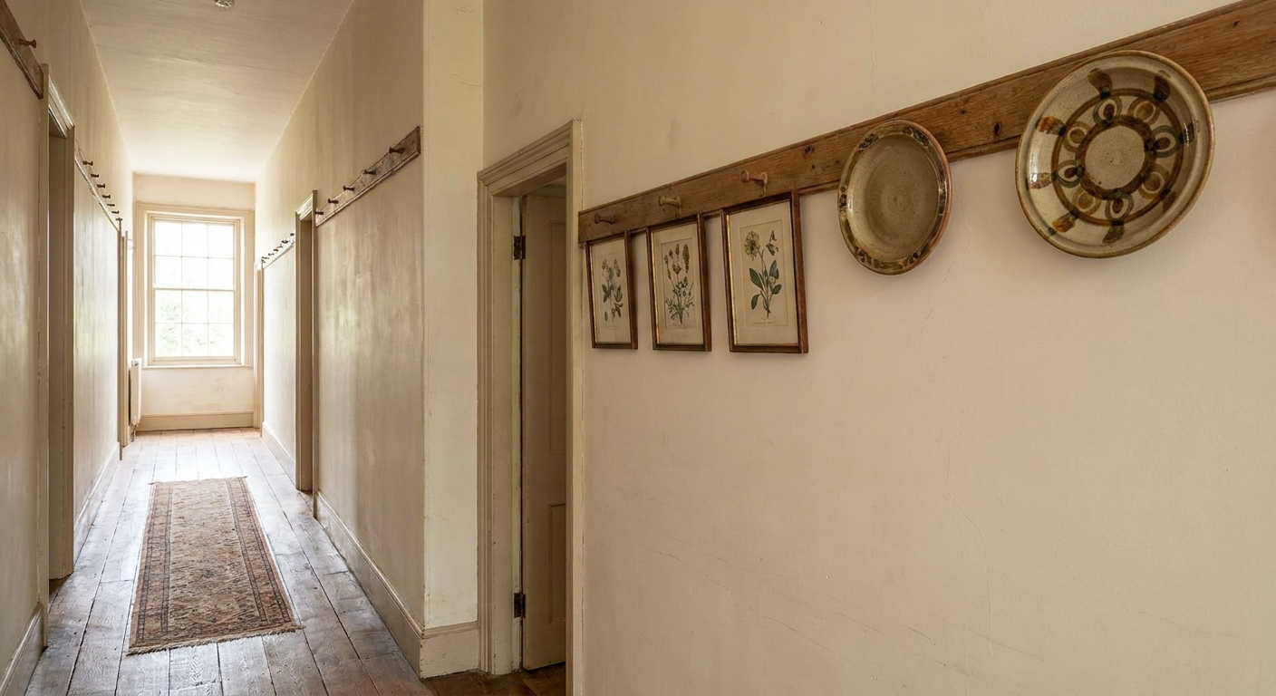
How to style it
The easiest mistake is treating the rail like storage. It is a display zone. When it is overfilled, it stops reading as charming and starts reading as clutter.
My “3 textures” formula
- Flat art: a few small frames or matted prints for structure.
- Round shapes: plates or a shallow bowl to soften the lines.
- Natural texture: a tiny wooden frame, a small woven piece, or a ceramic with a handmade glaze.
Spacing that feels calm
- Leave at least 1 to 2 inches between frames.
- Cluster items in small groups, then give breathing room before the next cluster.
- Keep the tallest item slightly off-center. Symmetry can look stiff on a rail.
How to stop frames from sliding
- Add a thin line of museum putty under the frame base if you have kids, pets, or a door slam nearby. Test it in a hidden spot first, and avoid it on delicate or valuable finishes where residue would be heartbreaking.
- Use frames with a slightly thicker profile. Ultra-thin frames are more likely to skate forward.
- Lean art back into the wall. If the rail is perfectly level but the wall bows, tiny felt pads behind frames can stabilize.
Finishes that hide scuffs
High rails are surprisingly good at collecting little dings from frame corners. The right finish makes that wear look like character instead of damage.
- Painted warm white: classic farmhouse, blends into trim, lets the art pop.
- Natural oak or pine: casual and bright, especially in kitchens.
- Medium walnut stain: gives contrast on light walls and feels more “vintage farmhouse” than “new build.”
- Soft black: a modern farmhouse option that still reads rustic when paired with stoneware.
If your room needs to feel bigger as well as cozier, paint choice matters. I keep a shortlist here: paint colors that make a small room look bigger.
Install tips for high walls
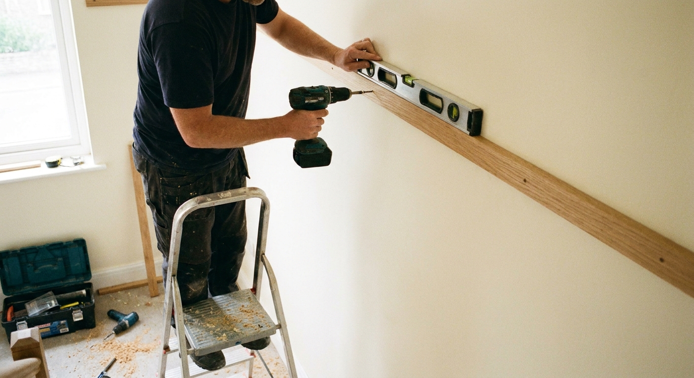
I am not precious about DIY, but I am careful when anything is mounted high. Gravity does not care that it is “just decor.” If you are displaying plates or glass frames, treat the rail like a functional shelf.
Before drilling
- Tape test: run painter’s tape where the rail will go, then stand back across the room. This catches bad heights fast.
- Mock the depth: hold a scrap board that matches the rail depth against the wall to see how far it will project.
- Find studs when you can: especially if you plan to use real plates. If you cannot hit studs, use wall anchors rated for shelves, not picture hooks.
Bracket and weight reality check
Plates add up faster than you think. I keep it simple: use at least two solid mounting points for any rail, add a third for longer runs, and prioritize stud attachment when the display includes anything breakable. If a rail is going over a seating area or a walkway, I am even more conservative.
Level, but also visually level
Older homes can have charmingly imperfect walls. If the ceiling line is off, a perfectly level rail can look crooked. In that case, I choose what the eye will read: align to the top of nearby trim or cabinetry so it looks intentional.
If you like farmhouse wall details in general, you might enjoy installing a Shaker peg rail too. Peg rails are fantastic in entryways and mudrooms, and they keep the floor clear the way a plate rail does.
Best spots for plate rails
These are the locations where I see the best payoff, especially in smaller layouts.
- Dining room or breakfast nook: high rail over a sideboard gives you personality without bulky hutch storage.
- Kitchen above a window: great for small plates and tiny frames, but keep it away from heavy steam zones. If it sits near cooking, plan to wipe the rail more often since grease and dust love a shallow ledge.
- Hallway: adds warmth to a pass-through space without narrowing it further.
- Above a sofa: a slim rail can feel lighter than a deep picture ledge, and you can shift art around without measuring.
- Stair wall: a rail can follow the angle, but it is not always a quick install. You may need clean miters, and items can creep on a slope, so keep it simple and use felt pads or putty for stability.
Common mistakes
Mistake: Installing too low
Fix: If it is a seating area, move it up so the bottom of the rail is at least 8 to 10 inches above the tallest seat back. In a hallway, err higher.
Mistake: Choosing a rail that is too deep
Fix: Swap to a 3 to 4 inch ledge or use two narrower rails rather than one big shelf. The whole point is shallow display.
Mistake: Styling it like storage
Fix: Pull everything off. Put back only what you truly like, then stop at about 70 percent full. That little bit of empty space is what reads “curated.”
Mistake: Everything is the same size
Fix: Mix one larger piece of art with smaller frames, then add one round plate for contrast. Variation is what gives farmhouse displays that collected feel.
A starter layout
If you want a low-stress way to begin, here is a layout I use when I am helping friends who feel stuck.
- Start with one medium frame (8 x 10 or similar) slightly left of center.
- Add one plate to the right, slightly overlapping behind the frame by about 1/2 inch.
- Tuck two small frames on the other side, varying heights by an inch or two.
- Finish with one small textured piece (tiny wood frame, small pottery tile, or a shallow bowl) near an end.
Live with that for a week. Once it feels normal, you can extend the display outward. Slow decorating is underrated, especially when you are trying to keep a home feeling peaceful.
And if you are actively trying to keep decor from turning into clutter, I lean on this mindset constantly: the one-in, one-out rule for small homes.