
Paint Colors That Make a Small Room Look Bigger

When I was living in my tiniest studio apartment, I learned the hard way that “just paint it white” is not actually a plan. I painted one room a bright, icy white that looked clean in the store and then somehow made my walls feel closer together at night. The fix was not expensive or complicated, but it did require choosing color with intention: light, yes, but also the right undertone, the right sheen, and a layout that did not chop the room up visually.
This is my practical, no-drama guide to choosing paint colors that make a small room look bigger, using light hues, monochromatic schemes, and strategic accent walls.
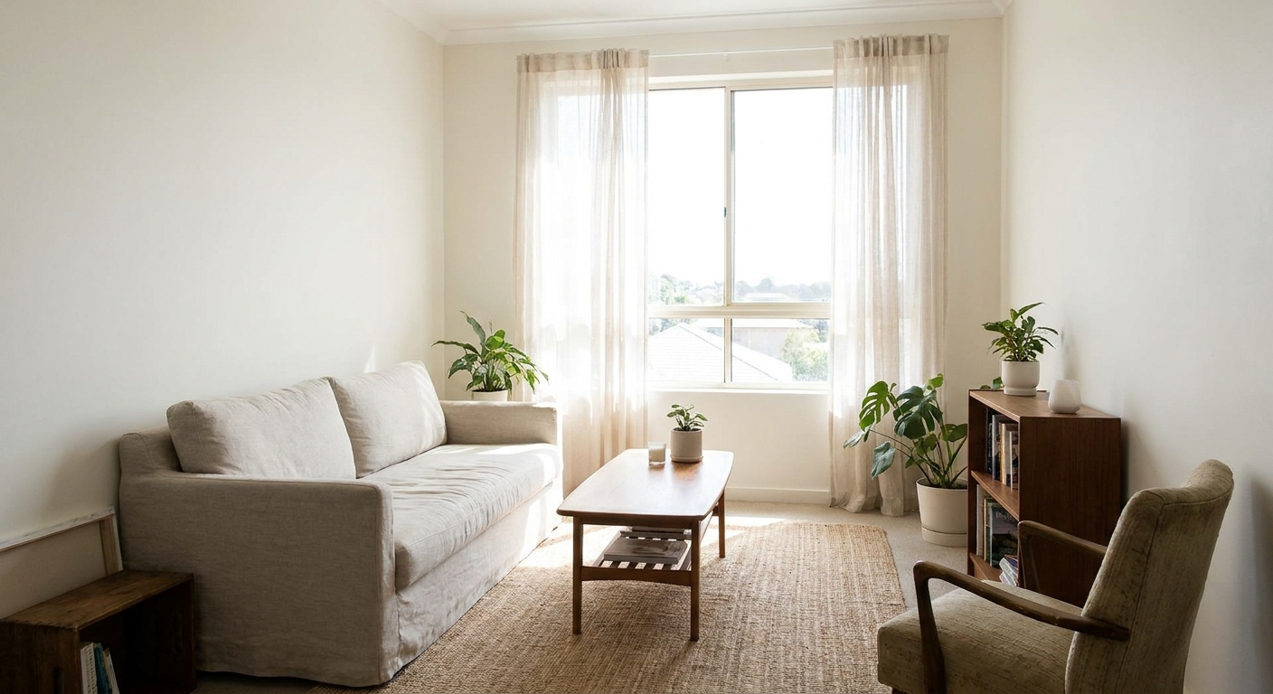
What makes a small room feel bigger
Paint cannot change square footage, but it absolutely changes how your eye reads the edges of a space. A room tends to feel larger when:
- The boundaries are less obvious. Low contrast between walls, trim, and ceiling can blur corners and edges.
- Light bounces around. Lighter colors often help, and so can the right sheen and lighting. LRV (light reflectance value) is one factor, but not the only one.
- The palette is consistent. Fewer hard color stops make your eye travel farther without interruption.
- Visual “weight” stays low. Dark or intense colors can be beautiful, but they can also pull surfaces forward.
That does not mean you must avoid darker colors forever. It just means you use them where they create depth, not where they close the room in.
Start with your room’s light
Before you fall in love with a color name, take five minutes to figure out what your room is working with. In small spaces, light is everything.
Quick light check
- North-facing: Light tends to feel cooler and flatter. Warm whites and greiges often help.
- South-facing: Light is warmer and stronger. Many whites work, and you can usually go slightly deeper without shrinking the room.
- East-facing: Warm morning light, cooler afternoons. Choose a balanced neutral.
- West-facing: Cooler mornings, warm late-day glow. Watch for colors that look too yellow at sunset.
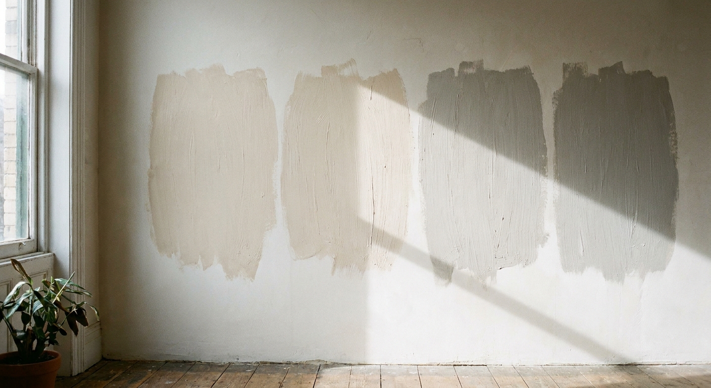
If you can, test paint on two walls: one that gets the most light and one that falls into shadow. In a small room, that contrast can be dramatic.
Light hues that open a room
Light colors work because they reflect more light and keep walls from visually advancing toward you. But the real trick is choosing a light hue that does not feel stark or dingy in your specific room.
Choose an off-white
In small rooms, super-bright white can create harsher contrast with shadows, especially in rooms with limited daylight. A soft off-white often feels larger because it reads as continuous and calm.
- Good direction: creamy whites, soft warm whites, gentle bone shades
- Be cautious with: icy blue whites in rooms with limited daylight (they can read gray and a bit tight)
Try pale color, not just neutral
A whisper of color can give you the airy benefit of “light” without the flatness some whites have. My favorites for small spaces are:
- Soft warm greige: cozy, flexible, and forgiving around clutter
- Pale sage or muted green-gray: calming and great for bedrooms and offices
- Misty blue-gray: fresh, especially in bathrooms
- Dusty blush-beige: warm and flattering in evening light
If you want more help building a whole-room palette, my starting point is our site guide: Home Decor Guide.
Go monochromatic
If I could give just one small-space painting tip, this is it: reduce contrast. A monochromatic scheme means using the same color family on walls, trim, and sometimes the ceiling, with small shifts in sheen or one step lighter or darker.
Three easy options
- Walls and trim the same color, different sheen: eggshell on walls, satin or semi-gloss on trim. The trim still looks finished, but it does not outline the room like a frame.
- Walls and ceiling close in color: ceiling painted the same color as walls, or one to two steps lighter. If you want it mixed, you can ask for a 50% tint of the wall color.
- One color family across adjoining spaces: especially helpful in apartments or open-plan small homes where you can see multiple rooms at once.
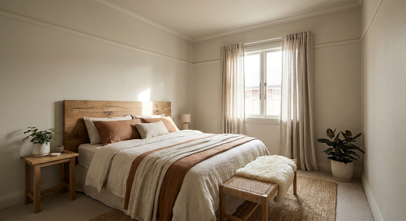
Monochromatic does not mean boring. You bring in depth with texture: curtains, rugs, woven baskets, wood tones, and art.
Undertones matter
Two paints can look identical on a tiny chip and completely different on four walls. The reason is undertone. In small rooms, undertones are often more noticeable simply because the walls are closer and you see more of the color at once.
Common undertones to watch
- Yellow undertone: can feel sunny, but may look creamier (or slightly dingy) in low light.
- Pink or peach undertone: often reads cozy and soft, but can turn too warm next to orange-toned wood.
- Green undertone: can look calm and sophisticated, but might flash green next to certain LEDs.
- Blue undertone: crisp and fresh, but can look cold in north-facing rooms.
A simple test that saves regrets
Hold a bright white sheet of paper up to your wall and compare it to your paint sample. The undertone usually reveals itself immediately. If the sample suddenly looks greenish, purplish, or muddy, keep shopping.
How to sample paint
If you want your test to tell the truth, go bigger than a little square on the wall.
- Paint a large poster board (or two) and move it around the room.
- Check it next to what stays, like flooring, tile, and your biggest rug.
- Leave a small air gap between the sample board and the wall when you can. It helps you see the color without the wall color influencing it.
- Look at it at three times: morning, afternoon, and evening with lamps on.
Accent walls for depth
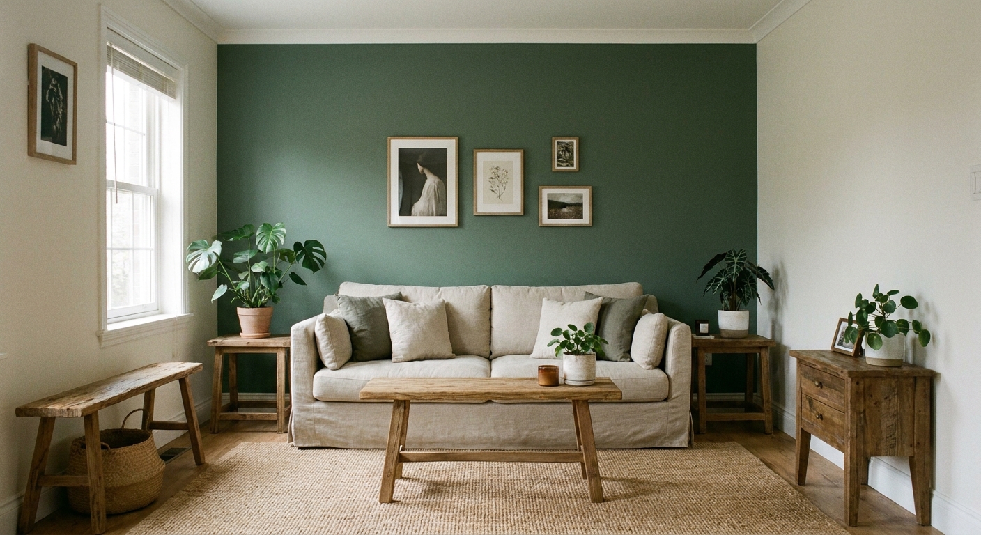
Accent walls can make a small room look bigger, but only when they create the illusion of extra depth. The goal is to push one plane back, not slice the room into pieces. Placement is situational, so it is worth testing with a sample first.
When an accent wall often works
- On a shorter wall to help a room feel wider (especially if furniture is arranged to emphasize that wall)
- Behind the bed to anchor a bedroom without crowding it
- At the far end of a narrow room to create a sense of distance, depending on windows and sight lines
What color should it be?
In a small room, I like an accent wall that is:
- 1 to 3 steps deeper than the other walls, in the same family
- Muted rather than ultra-saturated (high saturation can jump forward)
- Matched to the room’s undertone so it looks intentional, not like a random rectangle
If you are tempted by a bold color, consider doing it as a half wall, a painted arch, or painting built-ins instead. Those add personality without boxing you in.
Ceiling, trim, and doors
These are the sneaky spots that can either expand a room or outline it like a shoebox.
Ceiling strategies
- Same color as walls: great for low ceilings or awkward angles. It reduces hard lines.
- Slightly lighter than walls: keeps an airy feel while still minimizing contrast.
- Avoid stark white ceilings if your walls are warm. That contrast can make the ceiling feel lower.
Trim and door strategies
- Color-drenching (trim and doors same as walls): one of the fastest ways to make a small room feel calmer and bigger.
- Soft contrast: trim slightly lighter than the walls in the same undertone, not bright white.
In busy family homes, I find low-contrast trim also looks less “marked up” between cleanings, which is a nice bonus.
Pick the right finish
Finish is not just about durability. It changes how light behaves.
- Matte: hides wall flaws, feels cozy. In very low light rooms, matte can absorb light and feel a bit flatter.
- Eggshell: my go-to for small rooms. It reflects a little light, wipes reasonably well, and does not scream “shine.”
- Satin: brighter and more washable. Can highlight bumps and roller marks on older walls.
- Semi-gloss: best saved for trim and doors.
If your room gets strong direct sun, too much sheen can create glare. If your room is dim, a touch more sheen can help bounce light and open things up.
Color directions to try
Here are color directions that tend to work across many small homes. These are not brand-specific, so you can match them anywhere.
Small living rooms
- Warm white with a gentle creamy undertone
- Light greige with a soft taupe base
- Pale mushroom beige (especially with warm woods)
Small bedrooms
- Soft warm greige for calm and flexibility
- Muted sage-gray for a quiet, cozy feel
- Dusty blue-gray if you like a cooler look
Small bathrooms
- Off-white that matches your tile undertone
- Misty blue or blue-gray (spa-like without going dark)
- Very pale green-gray (fresh, not minty)
If you are decorating on a tight footprint overall, you may also like our guide: Small Spaces Guide.
Choose a color step by step
- List what stays. Flooring, tile, countertops, or a big rug. Your paint should play nicely with these undertones.
- Pick a light base. Off-white, pale greige, or a soft tinted neutral.
- Decide your contrast level. For “bigger,” aim low contrast: similar wall, trim, and ceiling tones.
- Test in bright and shadow areas. Check morning, afternoon, and night lighting.
- Choose finish intentionally. Eggshell is a safe starting point for most small rooms.
- Add depth thoughtfully. Use a deeper accent only if it creates distance or anchors a focal point.
Mistakes to avoid
- High contrast trim. Bright white trim around medium walls can outline the room like a box.
- Too many color changes. Different walls, different trim, different ceilings, plus different adjacent rooms can feel choppy.
- Ignoring bulbs. The wrong color temperature LED can make a perfect paint look green, gray, or sickly. If you can, decide on bulb temperature first and stick with it in the room.
- Going too saturated. Bright, intense color often advances. Muted versions usually feel more spacious.
Small-room paint FAQs
Do white walls always make a room look bigger?
Not always. White can make a room feel bigger, but only if it works with your room’s natural light and undertones. Some whites turn cold or gray and make the space feel tighter. Off-white is often a safer “bigger” choice.
Should I paint a small room dark?
You can, especially if you are going for cozy depth. Dark colors can blur edges in a moody way, but they also absorb light. In most everyday small rooms, a light to mid-tone muted color gives you “bigger” without losing brightness.
What helps a low ceiling feel higher?
Keep contrast low. Paint the ceiling the same color as the walls or slightly lighter, and avoid stark white trim that creates a hard horizontal line.
Will painting trim the same color as the walls really help?
Yes. In small rooms, it is one of the quickest ways to visually simplify the perimeter and make the room feel less chopped up.
An easy starting point
If you feel stuck, pick a soft off-white or light greige that matches your fixed finishes, then run a low-contrast plan: walls, trim, and ceiling all close in tone. That one choice does so much heavy lifting in a small room.
And if you are working through a whole-house refresh, I keep our core decorating resources bookmarked here: Home Decor Guide.