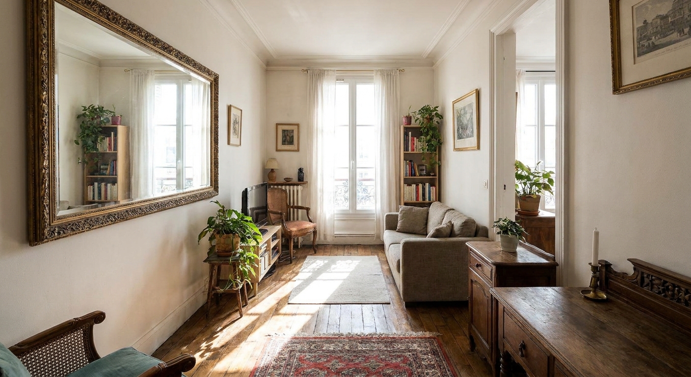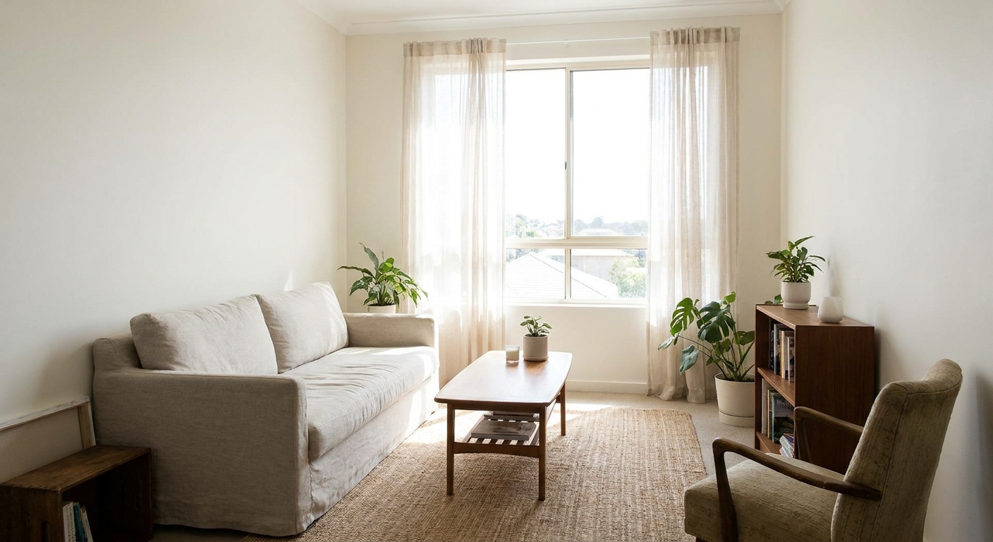
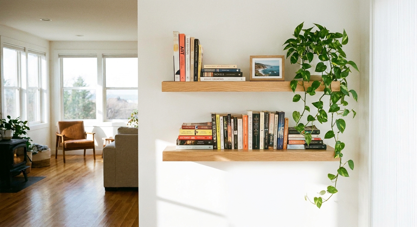
Make small rooms feel taller and calmer with floating shelves. Learn where to hang them, install them securely, and style with negative space, balanced group...
A Minimalist Gallery Wall for a Narrow Hallway

Published · Last updated
The narrow hallway in my first studio apartment was basically a long beige tube. I wanted it to feel like “me,” but every time I tried hanging a few prints, it looked busy and lopsided, and somehow the hallway felt even tighter. The fix was not more art. It was a calmer plan.
A minimalist gallery wall is perfect for a corridor because it adds warmth and personality without turning your walkway into visual clutter. Below is my no-drama, step-by-step method for getting a cohesive look, even when you do not have much wall width to work with.
Start with hallway basics
Hallways are “high traffic, low patience” zones. People move quickly through them, and anything that sticks out becomes a shoulder check waiting to happen. Before you choose art, lock in these three basics:
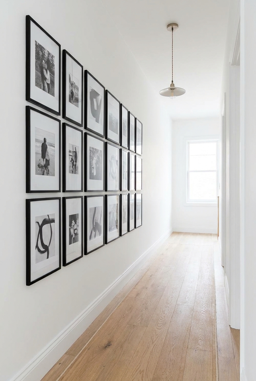
- Keep it flat. Choose frames that sit close to the wall. Skip deep shadow boxes or anything with chunky ledges.
- Keep it consistent. Repeating the same frame finish and mat style is what makes it minimalist, even if your art is eclectic.
- Keep it breathable. A little empty wall is not wasted space. In narrow corridors, negative space is part of the design.
If your hallway also feels dark, pairing art with better light placement helps the whole wall read as intentional. My mirror tips can help bounce daylight down a tight passage: Best mirror placement for more natural light in tiny apartments.
Step 1: Keep the palette tight
If you take only one minimalist trick from this article, make it this: limit your palette.
My easiest formula
- Frames: all black, all white, or all light wood
- Mats: all white (or all off-white)
- Artwork colors: mostly black and white, plus one accent color (green, terracotta, navy, whatever you love)
That combination keeps the wall calm, even when you are working with a narrow slice of space.
If you are painting soon, a lighter wall color can make the whole display feel less crowded. I keep a shortlist here: Paint colors that make a small room look bigger.
Step 2: Pick a layout
Minimalist gallery walls look best when the arrangement feels orderly. In hallways, these three layouts are the most forgiving.
Option A: One clean line
Hang frames in a single horizontal row, all the same size, with equal spacing. This reads calm and modern, and it is very hard to mess up.
Option B: A small grid
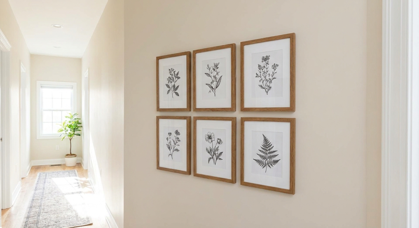
Think 2 × 3 or 3 × 3. Grids feel minimalist because they are structured, even if the art varies.
Option C: One hero, two supports
One larger piece centered, with two smaller pieces above and below (or side-by-side beneath). This gives you impact without filling the wall with lots of small items.
Step 3: Measure first
This is the unglamorous part that saves you from ten extra holes.
What to measure
- Wall width (the usable section, not counting door trim)
- Wall height from baseboard to ceiling
- Obstacles like thermostats, light switches, vents, and door swings
Spacing ranges that usually work
- Between frames: start with 2 to 3 inches for a clean look (go a bit tighter for tiny frames, wider for bigger pieces)
- From door trim: start with 4 to 6 inches if you can (less is fine if the wall segment is short, but keep it consistent)
- From corners: avoid cramming art into the last few inches of a hallway corner, it reads accidental
Quick height tip: A common starting point is to hang so the center of the overall arrangement lands around 57 to 60 inches from the floor. It is a guideline, not a law. If your ceilings are low, you are styling over a bench, someone in your home uses a wheelchair, or your hallway is a backpack bump zone, adjust until it feels natural for how you actually live there.
Step 4: Lay it out on the floor
I do this every time, even now. It is the easiest way to spot problems before the wall gets involved.
- Clear a floor space roughly the size of the wall section.
- Arrange your frames in your chosen layout.
- Stand up and look from hallway distance. If it feels busy, remove one piece and give the rest a little more air.
- Take a photo so you can recreate the arrangement without guessing.
If you are trying to keep surfaces calm near the hallway too, floating shelves can be great, but they need restraint in narrow spaces. I shared my approach here: Styling floating shelves without losing floor space.
Step 5: Use paper templates
When you are working in a tight corridor, being “a little off” shows up fast. Paper templates make the whole process calmer.
How to do it
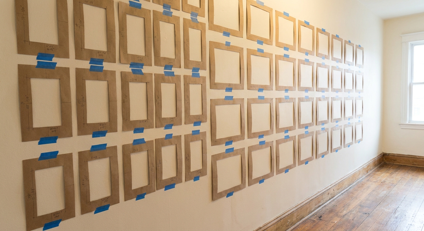
- Trace each frame onto kraft paper, printer paper taped together, or grocery bags cut flat.
- Mark the hanger point on the paper template (where the nail or hook needs to land).
- Tape templates to the wall with painter’s tape.
- Live with it for a day if you can. Walk through the hallway. Notice if anything feels too low or cramped near a doorway.
Do not guess the hanger point
This is where templates go wrong, especially when you mix frame types.
- Sawtooth hangers: the nail usually lands near the center, but test it. Hold the frame on the wall, find the balance point, then mark it.
- D-rings (with wire): wire lifts when hung, so your nail point will be higher than the hardware. Pull the wire up with one finger until it is taut (the way it will sit on the hook), then measure from the top of the frame down to your hook point.
- D-rings (no wire): measure from the top of the frame down to the ring holes, then transfer that measurement to the template.
This one step has saved me from the classic hallway mistake: hanging everything too close together because you are afraid to use wall space.
Step 6: Hang in order
Once your templates look right, hang strategically.
- Start with the anchor. In a grid, this is typically the center frame. In a row, start at the midpoint of the wall.
- Work outward. Add frames left and right (or up and down) so the layout stays balanced.
- Use the right hardware. Lightweight frames can use picture hooks or wall anchors depending on your wall type. Heavier pieces should be properly anchored into studs or rated anchors.
- Level every frame. A tiny tilt looks bigger in a narrow hallway because the wall is so close to you.
Kid and pet note from my current house: If your hallway is a daily stampede zone, acrylic glazing can be a smart choice because it is lighter and more shatter-resistant than glass. The tradeoff is it can scratch more easily, so wipe it gently and avoid gritty cleaners. If you love glass, place your most precious pieces a little higher.
Quick lighting help
Hallways love to be moody in the worst way. If your gallery wall looks flat or gloomy, lighting is usually the missing ingredient.
- Go brighter than you think. A brighter bulb in the nearest ceiling fixture can make your frames feel intentional instead of forgotten.
- Pick a consistent bulb color. One warm tone throughout the hallway reads calmer than mixed temperatures.
- Consider a slim picture light. In very narrow halls, keep it low-profile so it does not stick out into the walkway.
Renter-friendly options
If you are renting (or you just hate patching), you still have options.
- Removable hanging strips: Use the weight rating as your ceiling, not your goal. Clean the wall first, press firmly, and give the adhesive time to set.
- Be picky about paint. Removable does not always mean damage-free on older paint jobs. If you can, test one strip behind a door first.
- Keep it light. Hallways are bump zones, so lighter frames plus lighter hardware is a win either way.
Finishing touches
If you want the hallway to feel styled, but still minimalist, these are my favorites:
- Match the frame finish to one other element nearby (a black handrail, brass doorknobs, or a wood bench).
- Repeat one motif in the artwork, like line drawings, botanicals, or soft landscapes.
- Add one simple runner to ground the space, especially if the hallway is long.
- Keep nearby surfaces clear. In narrow spaces, a cluttered console table makes the wall feel busier too.
If your hallway is also your home’s landing pad, a simple drop zone system makes the whole area feel more intentional. I walk through that here: Plan a small entryway drop zone.
Troubleshooting
It looks chaotic, even with matching frames
Usually spacing is inconsistent, or the art sizes are too mixed. Tighten your size range (example: all 8 × 10 and 11 × 14) and commit to a grid or row.
It makes the hallway feel narrower
Try fewer pieces with a little more air between them, or switch to lighter frames and generous mats. Also check height. If everything is low, it can feel like the wall is closing in.
I do not have much wall space because of doors
Choose one strong piece per wall segment rather than forcing a full gallery. Minimalist does not mean you must fill every stretch of drywall.
The frames get bumped
Use slimmer frames, hang a little higher, and avoid protruding hardware. A single row often works best, at a comfortable viewing height, unless you are in a bump zone where going slightly higher makes daily life easier.
A plan you can copy
If you want a starting point that works in most narrow corridors, here is my reliable setup:
- Layout: 2 × 3 grid
- Frames: six matching 11 × 14 frames with 8 × 10 mats
- Spacing: start at 2.5 inches between frames, then adjust based on your wall width
- Placement: aim for the center of the grid around 58 inches from the floor, then tweak for your ceiling height and traffic flow
- Art: four black-and-white prints, two prints that share one accent color
It is tidy, repeatable, and it looks intentional without turning your hallway into a visual obstacle course.
For more decorating ideas that stay practical in real homes, my main hub is here: Home decor guide.